
Today’s Dev Diary is written by Yal, who is one of the two artists working on Cally’s Caves 2 (along with OHKO). She shares some of her experiences and insights into the process of creating art for a 2d platformer.
A guest article? Does that mean… there is a guest?! Um, well, yeah. Long story short: OHKO asked me whether I was interested in helping out doing some weapon graphics for Cally’s Caves 2. I said yes. Done, stop yawning. Now let’s change subject to the actual graphics! =]
Since a large majority of all AAA games released nowadays are FPS games, it’s only natural that they use guns. The problem is, most of them also try to be vaguely realistic, which in turn means all weapons are of the type “fires bullets in a straight line”. Now how fun is that? This also generally results in unbalanced weapons, since if all weapons fire in a straight line, why bother getting more than one? The answer is: because every new weapon is tons better than the previous one, so why bother keeping that anyway?
Contrast that with a game like Cave Story by Studio Pixel:

(Official screenshot from the game manual)
You start out with a simple straight-line pistol, learn the ropes, then you’re presented a rocket launcher. As the second weapon. You won’t see that in any contemporary FPS game. In the next area, you’ll obtain a weapon that fire bouncy fireballs that follow the terrain, enabling you to hit enemies from above or below without even getting close. You can also obtain a hidden weapon that doubles as a shield from melee enemies and as a machine gun (!) in this area.
Every weapon has a use, every situation has a weapon of choice. Just like in Cally’s Caves 2!
But even if every weapon is unique in its use, it won’t help if all weapons look the same. If the weapons look different, not only is it easier to select the right one for the situation, you also perceive them differently when using them. That’s why I’ve spent tons of effort to give the weapons in CC2 unique personalities.
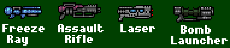
Lookin’ pretty good, huh? There’s actually some pretty simple tricks at work here. The most simple is basically use of color. It’s more clear the Freeze Ray is ice-elemental if it’s colored light blue. Most real weapons are either black or dull metal-colored, with the occasional wooden handle parts for being cozier to your shoulders. Thus they all look the same and lose personality. Why is part of the Assault Rifle cover purple? Because it’s better than gray.
Next trick: details. If you’re gonna pixel art instead of rectangle art, it’s important that you have as few rectangle-shaped regions of the same color as possible. Big regions of the same color just looks flat. Therefore I’ve eliminated flat regions by putting random pixels in the middle of ’em until it resembles something working carefully with the details.
And the final trick: letting the weapon personality/attributes shine through in its design. The ice ray probably uses liquid nitrogen (or some other cool gas) to freeze things, thus it needs a gas tank, therefore it has a round thingie in the back. The assault rifle probably has a massive recoil, thus it needs at least four handles so you can hold it steady when firing. The laser uses state-of-the-art high-tech shenigans, and those things are always powered by strange glow-in-the-dark energy cores. And so on. When each major detail in the design has a logical motivation, the design feels more complete.

I have experiences from what could happen if you don’t follow these tricks. My first metroidvania game, the unfinished Gun Princess, had a large number of weapons – 33 to be precise – and each of them had some unique ability. However, the design was largely haphazard (a crossbow that shoots boomerangs, for instance, is one of the best weapons) and most gun sprites were slightly edited repalettes. Luckily, most people didn’t notice because the guns played so differently. What they did notice, however was severe balance issues. Ahem.
Later, for Heart Of Ruin, I’d learned my lesson and cut down on the number of weapons and also introduced them one at a time as a means of player gating. I now put more energy into making the weapons look different. Which resulted in 8 incredibly differently (techni)colored weapons each the size of the protagonist and each more or less inconceivable as a practical weapon in a realistic setting (a gun that shoots a spray of oil? Come on!). Most people stuck with the basic machine gun through the entire game because it was the only weapon they could relate to.
I think the design track of CC2 is a reasonable middle ground: all weapons start out in a mundane shape, then gradually get more and more spaced out as you level them up. However, since you grow accustomized to the weapon in the process, you don’t scratch your head over how large it gets or what all those details are supposed to be. It’s still the same reasonable Flamethrower as before, it just evolved Pokémon-style and got stronger, and there’s nothing strange about that (sorta) so you can still use it.
