
If someone who has never made a game before decides to try to create one, it seems like it’s going to be pretty simple. Then that person will have a day – deep into the dev cycle – where they discover a technical requirement they didn’t think about, pull their hair out, and have a nervous breakdown. When we were working on the original Cally’s Caves, there was a certain day when it dawned on us that we were going to have to account for all the different resolutions that iOS devices use. It had never occurred to us in the planning phase that we were going to have to make the game work on anything more than one resolution, and it set us back quite a bit while we implemented our strategy. Thinking back on those days, it seems like it could be a useful exercise to document how we handle the resolutions in specific detail. We do this in the hopes that some others may come across the article and find it useful when they are dealing with the same issue.

Schools of Thought
There are a number of different ways you could handle scaling to different resolutions while developing a game. Looking at GameMaker: Studio specifically, if you look at the tutorial on resolution scaling, it shows you a method of scaling that allows landscape and portrait mode. It’s an adaptable scaling method that is run during every single frame of the game. This is the first school of thought when it comes to resolution scaling on mobile devices:
Detect the screen size and lay the game out from there.
It’s a really useful, low-effort way to scale your game to devices, and it also has the added benefit of future-proofing your game for any resolutions that may be added down the line. Let’s say Apple comes out with another new resolution next year. If your scaling code has the game figure out what the display size is and then lay things out accordingly, the game should look just fine on the new resolution. The upsides of using this method are pretty obvious; it’s quick, easy, future-proof, and should work on everything. We did not use this method of resolution scaling, however, and that was because of it’s one big downside: lack of control over the details. You could definitely test everything on all the different resolutions, see if anything looks weird, and adjust accordingly, however there still may be some things that look weird. iOS resolutions aren’t all the same aspect ratio, and so most scaling methods will leave you with black bars on the side, or a stretched view (which results in pixels not being drawn to scale and everything going wonky). We felt that there were too many downsides to using this method, so we decided to go with the other, more labor-intensive method:
Draw Everything Manually for Every Resolution
It’s obvious why this method is more time-consuming. It involves manually drawing a lot of things in code to get things perfect, but it gives you granular control over everything. In this school of thought, a developer would program everything for every view they anticipate the game being played on. For a platform like Android, it would be a nightmare because of the great number of resolutions in use on popular Android devices. On iOS, however, it’s much more simple, and with a little extra work, it’s easy to account for the 6 most popular iOS resolutions.
Coding for 6 Resolutions
The six resolutions we coded Cally’s Caves 1 and 2 for are as follows:
1136 x 640 (iPhone 5, 5s, iPod Touch 5th Gen)
960 x 640 (iPhone 4, iPhone 4s, iPod Touch 4th Gen)
1024 x 768 (iPad Mini – pre-retina, older iPads)
2048 x 1536 (iPad 2-4, iPad Air, IPad mini with Retina Display)
1334 x 750 (iPhone 6 – added retroactively)
2208 x 1242 (iPhone 6 plus – added retroactively)
We decided to leave out the old 480×320 resolution, since our games wouldn’t really run on anything pre-iPhone 4 anyway. These six resolutions were our targets and we coded the views in GameMaker: Studio accordingly. We use a drawing method that disables the application surface, and uses the view port settings to draw a smaller section of the level scaled up to the screen resolution. This optimizes our memory-usage and allows us to do more in the game than if we were drawing everything 1:1. For reference, most of the sprites in Cally’s Caves 2 were 32×32 pixels, however with the scaling we used and the pixel art, we managed to get away with the game still looking okay, despite all the art being drawn at about 2x scale (Note: It is not pixel perfect). So how did we draw the views?
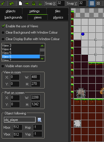
View Ports – > View
448 x 252 -> 1136 x 640
384 x 256 – > 960 x 640
512 x 384 – > 1024 x 768
512 x 384 -> 2048 x 1536
448 x 250 -> 1334 x 750
480 x 270 -> 2208 x 1242
You can set all these values in the room editor settings, or just use code to set them in a controller object (which is much easier). The optimization trick of drawing smaller objects at a bigger size also works great on iOS devices, but not as well on PC or devices with bigger screens. It only works with certain art styles, so use it cautiously!
The Final Product
After all of our view values were set, we had to draw all of the UI objects on screen at different sizes, depending on the view. If you use the draw event in GM:S, you can use the function “If view_current == 1” to draw stuff depending on the which view is active, or you could use other methods, such as detecting the display size. This is the granular control we were looking for. It allows us to customize all of our UI and on screen objects to draw at the exact size we want, and avoid any scaling or drawing glitches that can result in our UI sprites looking muddy or poorly scaled. Our in-game view sizes also allow us to see the world and sprites the same way, no matter what iOS device we are playing on. Even the different aspect ratios don’t affect the way the game looks, aside from being able to see more of the levels on the wider ones. You’ll see in the following screenshots that our system isn’t entirely perfect. It’s a pretty backwards way of doing it, and most developers would probably say that there are more time-efficient methods to deal with scaling. It’s worked for us so far, though, and it could potentially work for you too.
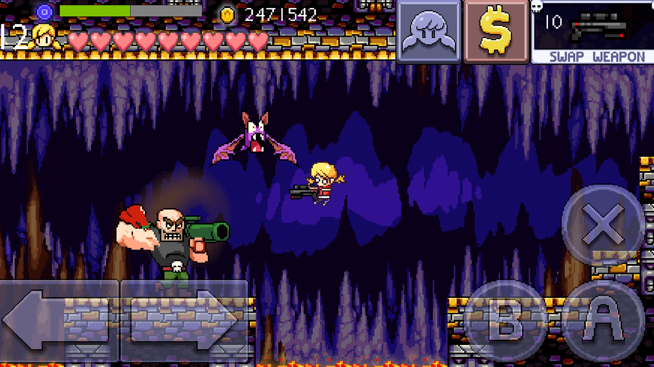
If you have any feedback, suggestions on how we could do it better, or questions, please let us know what you think. Here are the screens to show scaling to the resolutions in the order listed above:
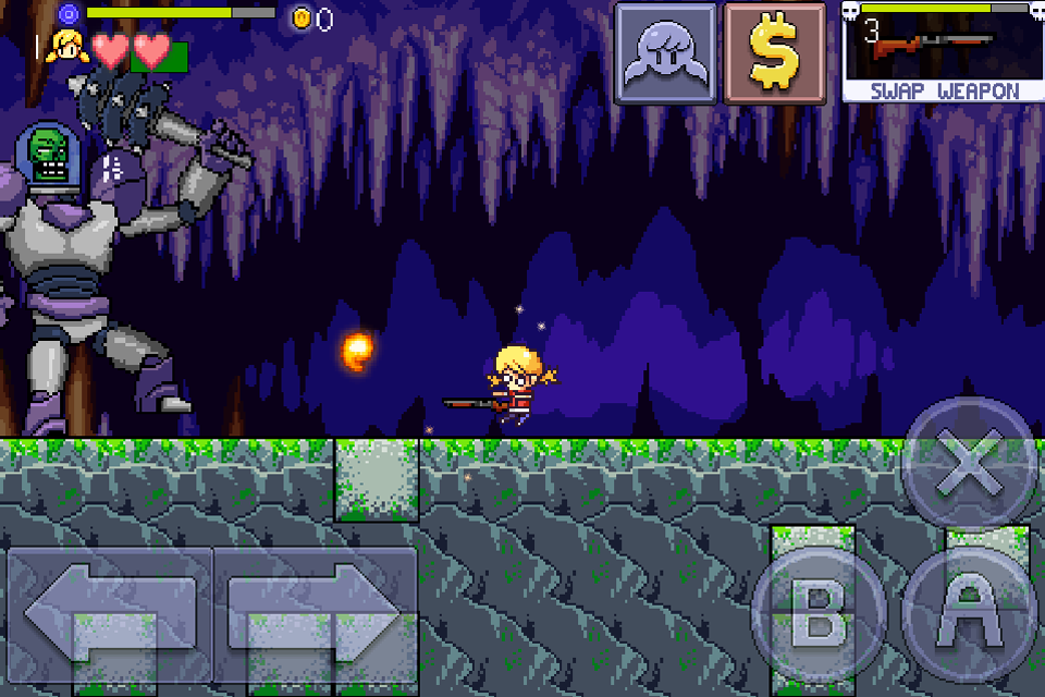
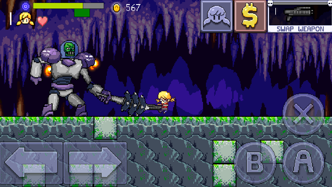
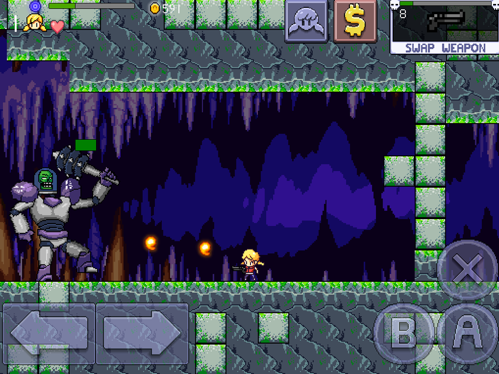
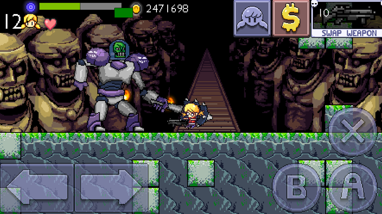
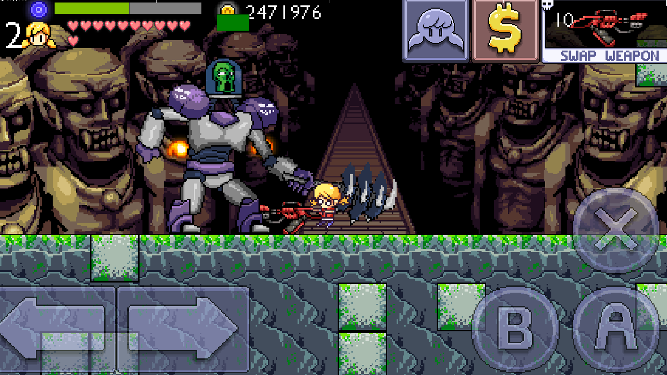
 Cally's Caves
still not pixel perfect for the 5, 6 and 6+. Clearly you can see that from the diagonal lines of the directional buttons
I don’t think it’s pixel perfect for any of them
added an edit to disclaim that it is not pixel perfect, thanks for the heads up!
I’m thinking of using vectors instead. Any experience using it ?
not outside of trying to make vector art in illustrator and then figuring out that I wasn’t good at it! I know they added vector sprite functionality in GM 1.3 though for sure.
When do u think its coming out
We are hoping for first of May
When do you think you can put these apps out for the android devices
We would love to have them out on Android right now! But the honest answer is we will put our games out on android if we make enough money to buy an android device to test it on